The Power of Color: How to Choose Art That Complements Your Space
Have you ever walked into a room and felt that everything just works? The furniture, the lighting, the colors — everything seems to belong. Sometimes, the secret is a single piece of art.
Artwork does more than fill an empty wall. It can change the mood of a room, add warmth, create contrast, and bring your interior together. The right piece can even transform a simple space into something memorable.
Choosing art that complements your home doesn’t have to be complicated. With a basic understanding of color and a little experimentation, you can find artwork that suits your space and reflects your personality.
Let’s explore how to make color work for you.
1. Start With the Mood You Want to Create
Before choosing artwork, think about how you want a room to feel.
A bedroom might call for calm and relaxation, while a living room could benefit from warmth and energy. A home office might feel more inviting with colors that inspire creativity.
Different colors can help create different moods:
- Blue and green often feel calming and natural, making them ideal for bedrooms, reading corners, and quiet spaces.
- Yellow, orange, and red bring warmth and energy, making them good choices for living rooms, dining areas, and creative spaces.
- Neutral shades such as beige, cream, gray, and brown create a relaxed, understated atmosphere.
- Dark tones such as navy, charcoal, and deep brown add depth and can make a room feel more intimate.
These are starting points, not strict rules. A vibrant yellow painting might energize one person and feel overwhelming to another.
Think about the atmosphere you want to come home to. Let that feeling guide your choice.
2. Work With the Colors You Already Have
One of the easiest ways to choose art is to look at your existing interior.
Notice the main colors in your walls, sofa, curtains, rugs, and furniture. Are they warm or cool? Are they mostly neutral, or does the room already have several bold colors?
If your space features white walls, beige furniture, and light wood, you have plenty of flexibility. Blue artwork can introduce a cooler feel, green can bring a natural touch, and a colorful abstract piece can create a striking focal point.
For rooms with darker furniture and warm wooden surfaces, consider artwork featuring rust, amber, earthy green, or deep brown.
You can also connect your artwork to a color already present in the room. A painting with touches of blue might complement a blue sofa, for example, without matching it exactly.
The goal is harmony, not perfect matching.
In fact, a little variation often makes an interior feel more natural and interesting.
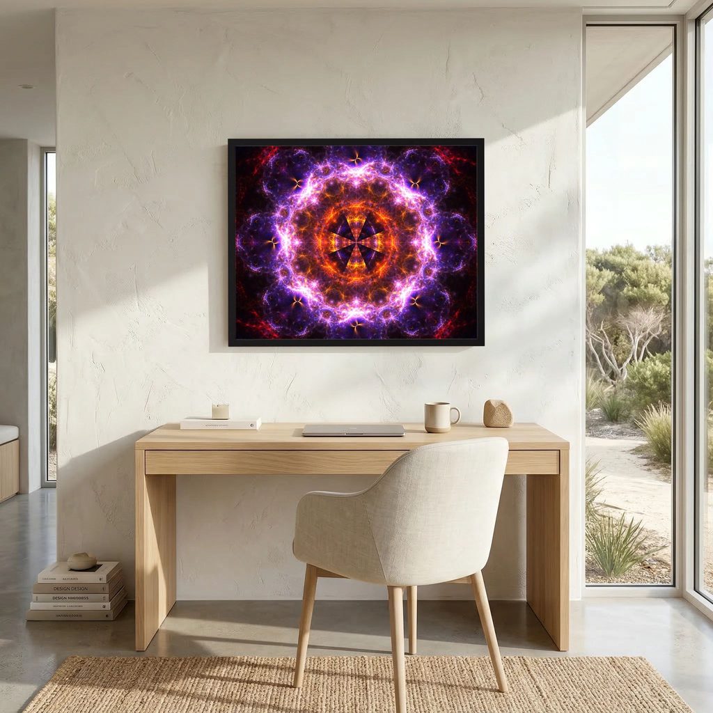
3. Use Complementary Colors to Create Contrast
Complementary colors sit opposite each other on a traditional color wheel. Common combinations include blue and orange, red and green, and yellow and purple.
When paired, these colors create contrast and help each other stand out.
Imagine a living room with a blue-gray sofa and neutral walls. An artwork featuring warm orange tones could add just the right amount of energy. Even small touches of orange can make the composition stand out.
Likewise, artwork with reddish-brown details can bring warmth to a green interior.
If bright colors feel too intense, try softer combinations such as dusty blue and terracotta or muted green and rose. You can enjoy the same color relationship without overwhelming the space.
Complementary colors are especially useful when you want your artwork to become a focal point.
You can also reverse the approach. If your room already features a bold color, choose art that complements it rather than introducing another competing shade.
The best combinations create interest while still feeling comfortable to live with.
4. Create Harmony With Similar Colors
If you prefer a calmer interior, try using analogous colors. These sit next to each other on the color wheel, such as blue, blue-green, and green.
Because they share similar characteristics, they tend to work together naturally.
Imagine a bedroom decorated with soft green textiles, neutral walls, and natural wood. An artwork featuring olive, moss green, muted gold, and brown could fit beautifully into the space.
This approach works particularly well in minimalist interiors, where subtle color changes can create interest without adding visual clutter.
Abstract art is a great example. A painting featuring several shades of blue, from pale sky blue to deep navy, can feel rich and expressive even with a limited palette.
If you want your home to feel cohesive and peaceful, look for artwork that shares the general color family of your interior.
You don’t need to repeat every shade. A few related colors are often enough to create a connection.
5. Remember That Lighting Changes Everything
Colors can look different depending on the light around them.
Natural daylight, warm lamps, and cool white bulbs all affect how artwork appears. A color that looks soft and neutral during the day might seem warmer or darker in the evening.
Before choosing a piece, consider where it will hang and how much natural light the room receives.
In a bright room, you can experiment with vivid colors, delicate pastels, or detailed compositions. In a darker space, artwork with lighter areas or strong light-dark contrast can help create visual interest.
That doesn’t mean you should avoid dark artwork in a room with limited light. Deep, atmospheric colors can create a beautiful sense of intimacy. It simply helps to consider the effect you want.
If possible, view the artwork in conditions similar to those in your home. Keep in mind that digital screens and printed artwork reproduce colors differently, so an online preview may not be an exact match.
Lighting is part of the overall experience, not just a practical detail.
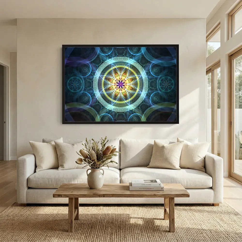
6. Bring Neutral Interiors to Life With Art
Neutral interiors are popular because they feel clean, timeless, and easy to style. But sometimes, a room filled with white, beige, and gray can feel a little flat.
Artwork offers a simple way to add personality without changing the furniture or repainting the walls.
A colorful abstract painting can become the room’s main focal point. A more restrained piece can add depth through subtle variations in tone, texture, and composition.
Fractal art is another interesting option for contemporary interiors.
Fractals feature repeating patterns and intricate structures that can resemble natural forms, flowing energy, or imaginary landscapes. Their visual complexity makes them engaging, while their color palettes can range from bold and vibrant to soft and minimal.
A blue fractal composition might bring a cool, spacious feeling to a neutral room. Gold and amber tones can add warmth, while monochromatic artwork can introduce detail without adding many new colors.
This makes fractal art a versatile choice if you’re looking for something distinctive and modern.
The key is to consider both the palette and the visual complexity of the piece. An intricate artwork may need more space around it, while a simpler composition can work well in a busier interior.
7. Find the Right Balance Between Color and Contrast
Color is important, but contrast also plays a major role in how artwork affects a room.
High-contrast art uses strong differences, such as bright highlights against deep shadows. It often feels dramatic and immediately attracts attention.
Low-contrast art features gentler transitions between shades, creating a softer, more subtle effect.
Consider the rest of your interior when deciding which approach to take.
If your room already has bold patterns, colorful cushions, and striking furniture, a softer artwork can help balance the space. If your interior is simple and understated, a high-contrast piece might provide the focal point it needs.
Size and detail matter, too. A large artwork with subtle colors can still dominate a room, while a small piece with intense colors can catch the eye immediately.
The strongest choices consider color, composition, size, and placement together.
You don’t need every element to stand out. Sometimes, the most effective artwork is the piece that quietly brings everything into balance.
8. Choose Art That Reflects Your Personality
Color theory is useful, but your personal connection to an artwork matters just as much.
Your home doesn’t need to look like a showroom. It should reflect your tastes, interests, and the things that make you feel comfortable.
Perhaps you’re drawn to deep blues because they remind you of the sea. Maybe you love golden tones, intricate patterns, or abstract compositions that reveal new details every time you look at them.
You might prefer minimalist artwork with plenty of open space, or you might enjoy complex images filled with movement and texture.
These preferences are worth following.
Sometimes, an artwork works because its colors complement the room. Other times, it works because it introduces something unexpected that you genuinely love.
If a piece makes you pause, sparks your imagination, or simply makes you happy to look at it, pay attention to that feeling.
A beautiful interior isn’t just a collection of matching objects. It’s a space that feels personal and meaningful.
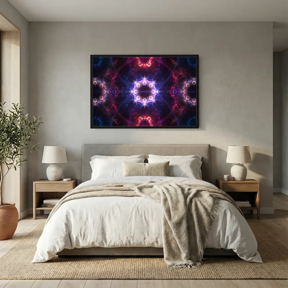
9. Get the Size and Placement Right
Even the right colors can lose their impact if artwork is poorly positioned.
Before buying a piece, measure the wall and consider the furniture around it. A small painting above a large sofa may feel disconnected, while an oversized piece in a narrow space might overwhelm the room.
As a general guideline, artwork above a sofa or bed often looks balanced when its width is around two-thirds to three-quarters of the furniture below it.
For a gallery wall, repeat a few colors across different pieces to create a connection between them. If you prefer a single statement piece, give it enough room to stand out.
The frame also affects the overall look. Black frames can strengthen contrast, natural wood adds warmth, and simple white frames often create a lighter, more contemporary feel.
If you’re unsure about the size or position, use painter’s tape to mark the artwork’s dimensions on the wall. This gives you a better sense of the proportions before committing.
A little planning can make a significant difference.
10. Experiment and Trust Your Eye
Choosing art doesn’t need to be a complicated process.
Start with the colors in your room, decide what mood you want to create, and explore pieces that either complement your existing palette or introduce an intentional contrast.
If you’re unsure, compare a few options. Notice how each one changes the atmosphere of the space.
You might discover that a muted palette feels more inviting than expected. Or perhaps a bold, colorful piece gives a simple room exactly the character it was missing.
You can also use digital previews or temporary paper mock-ups to explore different sizes and placements before making a decision.
Most importantly, give yourself permission to experiment. Your tastes may change, and your home can evolve with them.
There isn’t one perfect color combination or a single definition of a beautiful interior. What matters is finding an arrangement that feels right for you.
Final Thoughts: Let Color Tell Your Story
Color can transform the way we experience a room. It can create calm, introduce warmth, add energy, or bring different elements of an interior together.
By considering your existing palette, understanding complementary and analogous colors, and paying attention to lighting, contrast, and placement, you can choose artwork with greater confidence.
But there’s one principle worth remembering above all: choose art that makes your space feel more like your own.
Whether you’re drawn to colorful abstracts, natural landscapes, minimalist compositions, or intricate fractal art, let your surroundings guide you without limiting your imagination.
At Michal Dunaj Art, color, pattern, and visual depth offer endless possibilities for exploring how art can change a space.
Sometimes, the right artwork is the piece that fits your room perfectly. Sometimes, it’s the one that makes you see the room differently.
And sometimes, it’s simply the image you never get tired of looking at.
After all, your home should be more than a place that looks good. It should be a place that feels right.
Find the Art That Feels Right for Your Space
Looking for artwork that brings color, depth, and personality into your home? Explore Michal Dunaj Art and discover unique creations inspired by patterns, color, and the beauty of visual complexity.
Whether you’re drawn to bold colors or more subtle compositions, the right piece can transform a wall and give your space a character of its own.
Take a look at the collection and find an artwork that speaks to you. Your next favorite piece might be just what your space is missing.